
Yämmi App
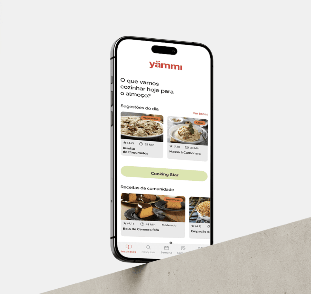
Yämmi is a Portuguese kitchen robot designed to simplify meal preparation. However, its digital experience lacked a dedicated platform to help users discover recipes, plan meals and get more from the product. Developed as an academic project at EDIT, this case study explores the design of a mobile app created to extend the Yämmi experience beyond the kitchen.
Client
EDIT. – Disruptive Digital Education
Segment
Food & Cooking, Mobile App
Year
2023
Role
UX/UI Designer
Expertise
Desk Research Survey Heuristic Evaluation Competitor Analysis Benchmark (Direct & Indirect) Problem Statement Wireframes Low-Fi & Hi-Fi UI Kit Visual Design Prototype

Research Methods
Heuristic Evaluation Desk Research Competitor Analysis Direct & Indirect Benchmarking Survey Color Accessibility Testing
Softwares & Platforms
Figma & Figjam Adobe Illustrator Adobe Photoshop Similarweb Accessible Brand Colors
Project Overview
The project focused on designing a mobile app to extend the Yämmi cooking experience beyond the kitchen. The app was designed to simplify everyday meal planning by bringing together recipe discovery, pantry management, and a shopping list connected to Continente Online.
Challenge
The main challenge was to identify the features that could genuinely support users throughout their meal-planning journey, from discovering recipes to organising ingredients and preparing meals. The project also explored the opportunity to connect the app with Continente Online, creating a more seamless experience while extending Yämmi’s ecosystem beyond the cooking process.

Starting Process
We began by exploring Yämmi’s existing digital ecosystem through desk research. Using Similarweb data, we analyzed the website’s audience profile, including age and gender distribution. We also reviewed customer feedback from retail platforms such as Worten to identify recurring experiences and pain points.
The research highlighted issues around navigation, discoverability and ease of use, helping us form initial hypotheses about users’ needs. To validate these assumptions with a broader audience, we followed up with a survey.

Survey
To validate our initial hypotheses, we conducted an online survey with 42 participants to better understand their cooking habits, feature priorities and expectations for a Yämmi app.
The results showed a clear preference for practical, time-saving features, with recipe discovery and smartphone usage emerging as key priorities. These findings reinforced a mobile-first approach and helped us prioritize the features and user flows explored in the next stage of the design process.
Heuristic Evaluation
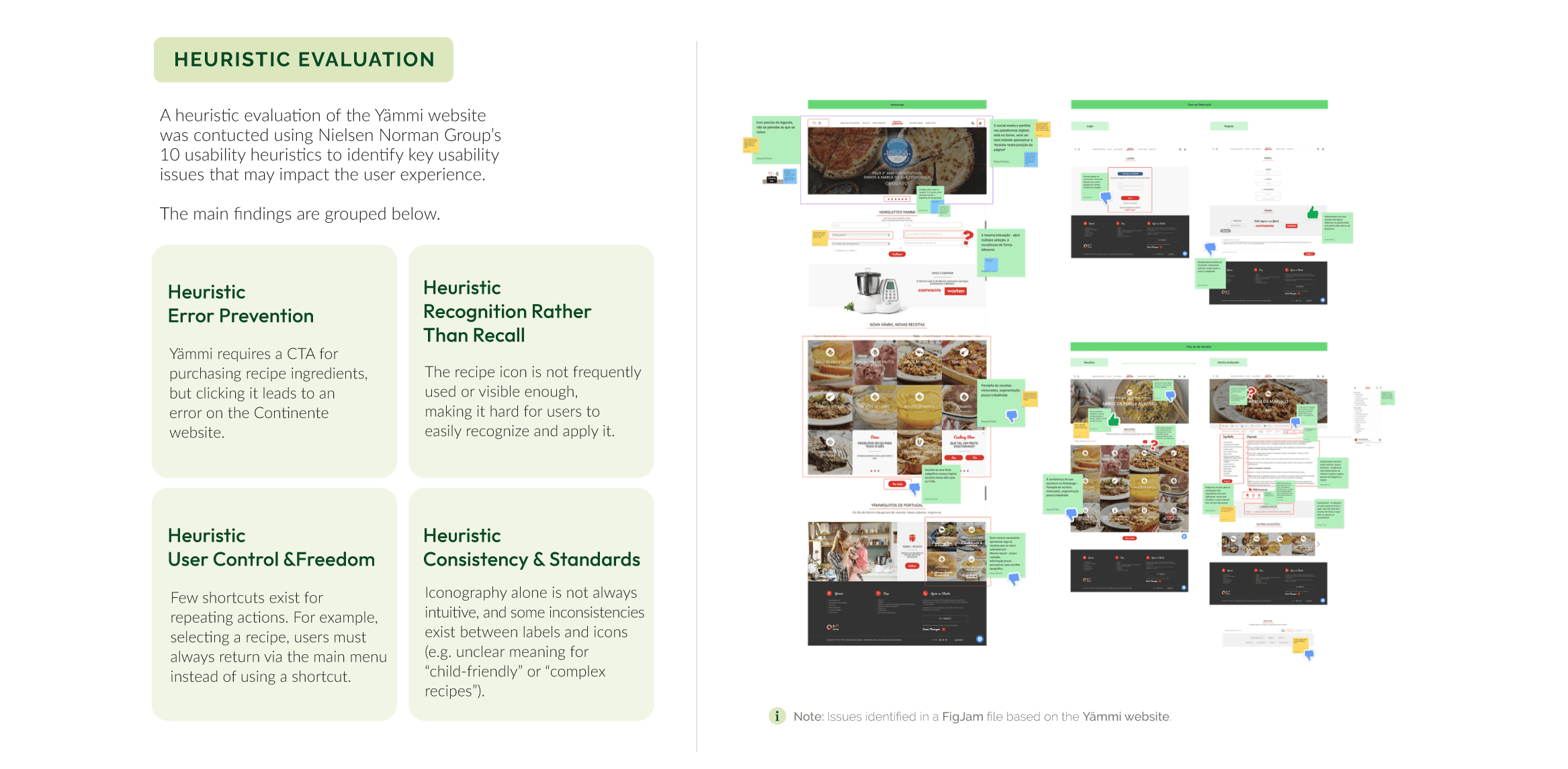
As part of the research process, I evaluated Yämmi’s existing website against Nielsen Norman Group’s 10 usability heuristics to identify usability issues and opportunities for improvement. The evaluation revealed recurring problems across navigation, error prevention, user control and consistency, particularly around finding content and completing key actions.
These findings helped define the main usability priorities and informed the interaction and navigation decisions developed throughout the redesign.

Benchmarking
To understand where Yämmi could improve its digital experience, I compared direct competitors in the cooking-app space with indirect references focused on specific user needs.
The direct analysis revealed recurring patterns in recipe discovery, filtering and recipe information, while the indirect benchmarking showed how dedicated shopping-list apps simplify planning and organization.
Together, these insights highlighted an opportunity to connect recipe discovery, meal planning and grocery shopping within a single experience, moving Yämmi beyond a recipe platform into a more complete cooking companion.

Persona & Problem Statement
Building on the insights gathered through desk research, survey responses and competitor analysis, we created a persona to represent the needs, behaviours and goals of our target user. Rather than describing a single individual, Joana Silva represents a recurring user profile identified throughout the research.
We then translated these findings into a problem statement, focusing the design challenge on making recipe discovery and grocery planning simpler and more connected. This gave us a clear direction for defining the features and user flows explored in the next stage.

Sitemap
The research findings highlighted opportunities to simplify Yämmi’s information architecture and improve feature discoverability. We restructured the existing website into a more task-oriented app architecture, bringing recipe discovery, cooking, meal planning, shopping and account management into a clearer navigation system.
This new structure became the foundation for defining the app’s key user flows.

Moodboard
The moodboard explored an energetic and contemporary visual direction, combining Yämmi and Continente’s brand identities with complementary tones. The palette was tested for accessibility to ensure clear contrast and readability.

Wireframes Low & Mid-Fi
We started with low-fidelity wireframes to explore the app’s structure, interactions and key user flows without focusing on visual details. Once the flows were refined, we translated them into mid-fidelity wireframes, adding more detailed layouts and components to prepare for the visual design stage.

Usability Tests
To validate the proposed solution, we conducted moderated usability tests with four participants, each completing two tasks: cooking a recipe using three ingredients and creating a shopping list for Carbonara. The sessions allowed us to observe how users navigated the prototype, identified key actions and understood the relationship between recipes, ingredients and shopping.
Both tasks were successfully completed by all participants, suggesting that the overall flows were understandable. However, the sessions also revealed several opportunities for improvement. Participants had difficulty finding how to add individual ingredients to a shopping list and were uncertain about how the purchase flow connected to the app and Continente Online. Navigation also raised questions around the distinction between “Explore” and “Search”, while features such as “My Pantry” could benefit from greater visibility.
These findings helped us refine the interaction model before moving into the UI Kit and Visual Design phases. Rather than redesigning the experience from scratch, we focused on removing friction from key actions and making important features and transitions more discoverable.

UI Kit
The UI Kit was developed to create a consistent and accessible visual language across the app. It defined the core typography, color palette, buttons, icons and components, providing a clear foundation for the final interface and ensuring consistency across key interactions.

Visual Design
The visual design translated the research and usability findings into a clear, functional and approachable interface. We focused on intuitive navigation, recognizable interaction patterns and accessible contrast, while extending Yämmi’s visual identity through its brand colors and complementary tones. The result was a cohesive interface designed to make recipe discovery, cooking and meal planning feel simple and connected.
Team
Carlota Matos Filipe Correia Raquel Brotas Soraia Pereira
Mentors
Francisco Mouga Hugo Oliveira Vieira Rui Soares
Impact
The project transformed our research findings into a mobile app concept that connects recipe discovery, cooking and grocery shopping within one experience. Usability testing helped refine the key flows and reduce friction around navigation, shopping lists and purchasing.
Beyond the individual features, the concept explored how Yämmi could extend its role from a cooking appliance into a more connected digital cooking companion.

Yämmi App
Yämmi is a Portuguese kitchen robot designed to simplify meal preparation. However, its digital experience lacked a dedicated platform to help users discover recipes, plan meals and get more from the product. Developed as an academic project at EDIT, this case study explores the design of a mobile app created to extend the Yämmi experience beyond the kitchen.
Client
EDIT. – Disruptive Digital Education
Segment
Food & Cooking, Mobile App
Year
2023
Role
UX/UI Designer
Expertise
Desk Research Survey Heuristic Evaluation Competitor Analysis Benchmark (Direct & Indirect) Problem Statement Wireframes Low-Fi & Hi-Fi UI Kit Visual Design Prototype
Overview
Yämmi is a Portuguese kitchen robot designed to simplify meal preparation. However, its digital experience lacked a dedicated platform to help users discover recipes, plan meals and get more from the product. Developed as an academic project at EDIT, this case study explores the design of a mobile app created to extend the Yämmi experience beyond the kitchen.
Categories
User Experience & User Interface
Client
EDIT. – Disruptive Digital Education
Research Methods
Heuristic Evaluation Desk Research Competitor Analysis Direct & Indirect Benchmarking Survey Color Accessibility Testing
Softwares & Platforms
Figma & Figjam Adobe Illustrator Adobe Photoshop Similarweb Accessible Brand Colors
Project Overview
The project focused on designing a mobile app to extend the Yämmi cooking experience beyond the kitchen. The app was designed to simplify everyday meal planning by bringing together recipe discovery, pantry management, and a shopping list connected to Continente Online.
Challenge
The main challenge was to identify the features that could genuinely support users throughout their meal-planning journey, from discovering recipes to organising ingredients and preparing meals. The project also explored the opportunity to connect the app with Continente Online, creating a more seamless experience while extending Yämmi’s ecosystem beyond the cooking process.
Starting Process
We began by exploring Yämmi’s existing digital ecosystem through desk research. Using Similarweb data, we analyzed the website’s audience profile, including age and gender distribution. We also reviewed customer feedback from retail platforms such as Worten to identify recurring experiences and pain points.
The research highlighted issues around navigation, discoverability and ease of use, helping us form initial hypotheses about users’ needs. To validate these assumptions with a broader audience, we followed up with a survey.
Survey
To validate our initial hypotheses, we conducted an online survey with 42 participants to better understand their cooking habits, feature priorities and expectations for a Yämmi app.
The results showed a clear preference for practical, time-saving features, with recipe discovery and smartphone usage emerging as key priorities. These findings reinforced a mobile-first approach and helped us prioritize the features and user flows explored in the next stage of the design process.
Heuristic Evaluation
As part of the research process, I evaluated Yämmi’s existing website against Nielsen Norman Group’s 10 usability heuristics to identify usability issues and opportunities for improvement. The evaluation revealed recurring problems across navigation, error prevention, user control and consistency, particularly around finding content and completing key actions.
These findings helped define the main usability priorities and informed the interaction and navigation decisions developed throughout the redesign.
Benchmarking
To understand where Yämmi could improve its digital experience, I compared direct competitors in the cooking-app space with indirect references focused on specific user needs.
The direct analysis revealed recurring patterns in recipe discovery, filtering and recipe information, while the indirect benchmarking showed how dedicated shopping-list apps simplify planning and organization.
Together, these insights highlighted an opportunity to connect recipe discovery, meal planning and grocery shopping within a single experience, moving Yämmi beyond a recipe platform into a more complete cooking companion.
Costumer Journey
Persona & Problem Statement
Building on the insights gathered through desk research, survey responses and competitor analysis, we created a persona to represent the needs, behaviours and goals of our target user. Rather than describing a single individual, Joana Silva represents a recurring user profile identified throughout the research.
We then translated these findings into a problem statement, focusing the design challenge on making recipe discovery and grocery planning simpler and more connected. This gave us a clear direction for defining the features and user flows explored in the next stage.
Benchmarking
Sitemap
The research findings highlighted opportunities to simplify Yämmi’s information architecture and improve feature discoverability. We restructured the existing website into a more task-oriented app architecture, bringing recipe discovery, cooking, meal planning, shopping and account management into a clearer navigation system.
This new structure became the foundation for defining the app’s key user flows.
Moodboard
The moodboard explored an energetic and contemporary visual direction, combining Yämmi and Continente’s brand identities with complementary tones. The palette was tested for accessibility to ensure clear contrast and readability.
Wireframes Low & Mid-Fi
We started with low-fidelity wireframes to explore the app’s structure, interactions and key user flows without focusing on visual details. Once the flows were refined, we translated them into mid-fidelity wireframes, adding more detailed layouts and components to prepare for the visual design stage.
Usability Tests
To validate the proposed solution, we conducted moderated usability tests with four participants, each completing two tasks: cooking a recipe using three ingredients and creating a shopping list for Carbonara. The sessions allowed us to observe how users navigated the prototype, identified key actions and understood the relationship between recipes, ingredients and shopping.
Both tasks were successfully completed by all participants, suggesting that the overall flows were understandable. However, the sessions also revealed several opportunities for improvement. Participants had difficulty finding how to add individual ingredients to a shopping list and were uncertain about how the purchase flow connected to the app and Continente Online. Navigation also raised questions around the distinction between “Explore” and “Search”, while features such as “My Pantry” could benefit from greater visibility.
These findings helped us refine the interaction model before moving into the UI Kit and Visual Design phases. Rather than redesigning the experience from scratch, we focused on removing friction from key actions and making important features and transitions more discoverable.
UI Kit
The UI Kit was developed to create a consistent and accessible visual language across the app. It defined the core typography, color palette, buttons, icons and components, providing a clear foundation for the final interface and ensuring consistency across key interactions.
Visual Design
The visual design translated the research and usability findings into a clear, functional and approachable interface. We focused on intuitive navigation, recognizable interaction patterns and accessible contrast, while extending Yämmi’s visual identity through its brand colors and complementary tones. The result was a cohesive interface designed to make recipe discovery, cooking and meal planning feel simple and connected.
Team
Carlota Matos Filipe Correia Raquel Brotas Soraia Pereira
Mentors
Francisco Mouga Hugo Oliveira Vieira Rui Soares
Developers
Impact
The project transformed our research findings into a mobile app concept that connects recipe discovery, cooking and grocery shopping within one experience. Usability testing helped refine the key flows and reduce friction around navigation, shopping lists and purchasing.
Beyond the individual features, the concept explored how Yämmi could extend its role from a cooking appliance into a more connected digital cooking companion.
Yämmi App
Yämmi is a Portuguese kitchen robot designed to simplify meal preparation. However, its digital experience lacked a dedicated platform to help users discover recipes, plan meals and get more from the product. Developed as an academic project at EDIT, this case study explores the design of a mobile app created to extend the Yämmi experience beyond the kitchen.
Client
EDIT. – Disruptive Digital Education
Segment
Food & Cooking, Mobile App
Year
2023
Role
UX/UI Designer
Expertise
Desk Research Survey Heuristic Evaluation Competitor Analysis Benchmark (Direct & Indirect) Problem Statement Wireframes Low-Fi & Hi-Fi UI Kit Visual Design Prototype
Project Overview
The project focused on designing a mobile app to extend the Yämmi cooking experience beyond the kitchen. The app was designed to simplify everyday meal planning by bringing together recipe discovery, pantry management, and a shopping list connected to Continente Online.
Challenge
The main challenge was to identify the features that could genuinely support users throughout their meal-planning journey, from discovering recipes to organising ingredients and preparing meals. The project also explored the opportunity to connect the app with Continente Online, creating a more seamless experience while extending Yämmi’s ecosystem beyond the cooking process.
Research Methods
Heuristic Evaluation Desk Research Competitor Analysis Direct & Indirect Benchmarking Survey Color Accessibility Testing
Softwares & Platforms
Figma & Figjam Adobe Illustrator Adobe Photoshop Similarweb Accessible Brand Colors
Starting Process
We began by exploring Yämmi’s existing digital ecosystem through desk research. Using Similarweb data, we analyzed the website’s audience profile, including age and gender distribution. We also reviewed customer feedback from retail platforms such as Worten to identify recurring experiences and pain points.
The research highlighted issues around navigation, discoverability and ease of use, helping us form initial hypotheses about users’ needs. To validate these assumptions with a broader audience, we followed up with a survey.
Survey
To validate our initial hypotheses, we conducted an online survey with 42 participants to better understand their cooking habits, feature priorities and expectations for a Yämmi app.
The results showed a clear preference for practical, time-saving features, with recipe discovery and smartphone usage emerging as key priorities. These findings reinforced a mobile-first approach and helped us prioritize the features and user flows explored in the next stage of the design process.
Heuristic Evaluation
As part of the research process, I evaluated Yämmi’s existing website against Nielsen Norman Group’s 10 usability heuristics to identify usability issues and opportunities for improvement. The evaluation revealed recurring problems across navigation, error prevention, user control and consistency, particularly around finding content and completing key actions.
These findings helped define the main usability priorities and informed the interaction and navigation decisions developed throughout the redesign.
Benchmarking
To understand where Yämmi could improve its digital experience, I compared direct competitors in the cooking-app space with indirect references focused on specific user needs.
The direct analysis revealed recurring patterns in recipe discovery, filtering and recipe information, while the indirect benchmarking showed how dedicated shopping-list apps simplify planning and organization.
Together, these insights highlighted an opportunity to connect recipe discovery, meal planning and grocery shopping within a single experience, moving Yämmi beyond a recipe platform into a more complete cooking companion.
Costumer Journey
Persona & Problem Statement
Building on the insights gathered through desk research, survey responses and competitor analysis, we created a persona to represent the needs, behaviours and goals of our target user. Rather than describing a single individual, Joana Silva represents a recurring user profile identified throughout the research.
We then translated these findings into a problem statement, focusing the design challenge on making recipe discovery and grocery planning simpler and more connected. This gave us a clear direction for defining the features and user flows explored in the next stage.
Persona & Problem Statement
Sitemap
The research findings highlighted opportunities to simplify Yämmi’s information architecture and improve feature discoverability. We restructured the existing website into a more task-oriented app architecture, bringing recipe discovery, cooking, meal planning, shopping and account management into a clearer navigation system.
This new structure became the foundation for defining the app’s key user flows.
Moodboard
The moodboard explored an energetic and contemporary visual direction, combining Yämmi and Continente’s brand identities with complementary tones. The palette was tested for accessibility to ensure clear contrast and readability.
Wireframes Low & Mid-Fi
We started with low-fidelity wireframes to explore the app’s structure, interactions and key user flows without focusing on visual details. Once the flows were refined, we translated them into mid-fidelity wireframes, adding more detailed layouts and components to prepare for the visual design stage.
Usability Tests
To validate the proposed solution, we conducted moderated usability tests with four participants, each completing two tasks: cooking a recipe using three ingredients and creating a shopping list for Carbonara. The sessions allowed us to observe how users navigated the prototype, identified key actions and understood the relationship between recipes, ingredients and shopping.
Both tasks were successfully completed by all participants, suggesting that the overall flows were understandable. However, the sessions also revealed several opportunities for improvement. Participants had difficulty finding how to add individual ingredients to a shopping list and were uncertain about how the purchase flow connected to the app and Continente Online. Navigation also raised questions around the distinction between “Explore” and “Search”, while features such as “My Pantry” could benefit from greater visibility.
These findings helped us refine the interaction model before moving into the UI Kit and Visual Design phases. Rather than redesigning the experience from scratch, we focused on removing friction from key actions and making important features and transitions more discoverable.
UI Kit
The UI Kit was developed to create a consistent and accessible visual language across the app. It defined the core typography, color palette, buttons, icons and components, providing a clear foundation for the final interface and ensuring consistency across key interactions.
Visual Design
The visual design translated the research and usability findings into a clear, functional and approachable interface. We focused on intuitive navigation, recognizable interaction patterns and accessible contrast, while extending Yämmi’s visual identity through its brand colors and complementary tones. The result was a cohesive interface designed to make recipe discovery, cooking and meal planning feel simple and connected.
Team
Carlota Matos Filipe Correia Raquel Brotas Soraia Pereira
Mentors
Francisco Mouga Hugo Oliveira Vieira Rui Soares
Developers
Francisco Mouga Hugo Oliveira Vieira Rui Soares
Impact
The project transformed our research findings into a mobile app concept that connects recipe discovery, cooking and grocery shopping within one experience. Usability testing helped refine the key flows and reduce friction around navigation, shopping lists and purchasing.
Beyond the individual features, the concept explored how Yämmi could extend its role from a cooking appliance into a more connected digital cooking companion.
