
Tap Air Portugal
TAP Air Portugal is Portugal’s national airline, connecting travelers to destinations worldwide. This project, developed in partnership with TAP and EDIT., explored how the airline’s digital experience could be improved by identifying usability issues and opportunities across its main website.
Client
TAP Air Portugal X EDIT. – Disruptive Digital Education Partnership for 360º Project
Segment
Travel & Aviation, Digital Experience
Year
2023
Role
UX/UI Designer
Expertise
Desk Research Survey Interviews Persona Problem Statement Direct & Indirect Benchmarking Usability Tests UI Kit Prototype

Research Methods
Desk Research Survey Interviews Persona Problem Statement Benchmarking (Direct & Indirect) Usability Tests
Softwares & Platforms
Figma & Figjam Adobe Illustrator Adobe Photoshop Similar Web
Project Overview
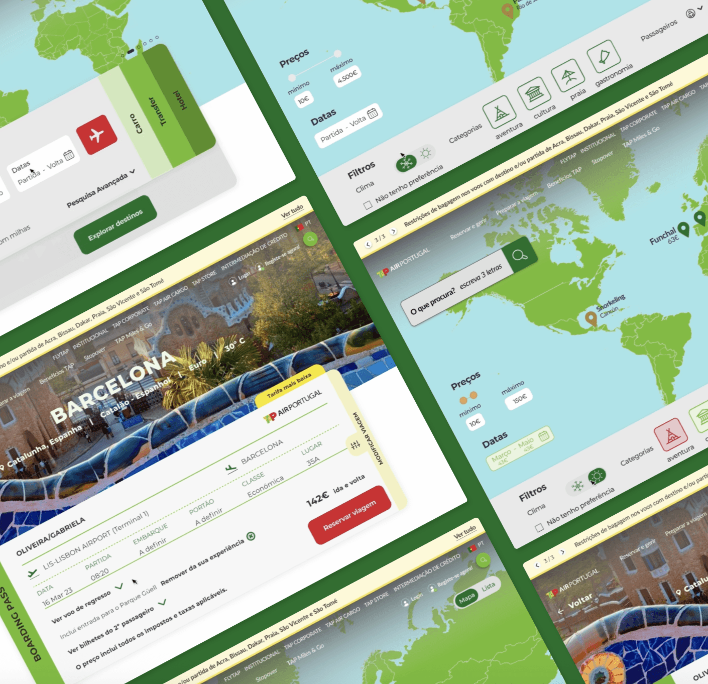
The project focused on redesigning the flight search experience on TAP Air Portugal’s website, one of the key steps in the booking journey. The goal was to make the search process more intuitive and flexible, helping users explore flight options based on different travel needs and preferences.
The redesign explored multiple scenarios, including users who had no fixed destination or travel dates, while introducing clearer interactions and more flexible search options.
Challenge
The main challenge was to design a search experience that could support different travel intentions without adding complexity. Users may know exactly where and when they want to travel, while others start with a budget, a flexible timeframe, or simply a desire to explore.
The challenge was therefore to create a more adaptable search flow that could accommodate these different behaviours while keeping the experience simple, clear, and efficient. This also presented an opportunity to make the booking journey feel more customer-centred from its very first interaction.

Starting Process
The project began with a brief from TAP Air Portugal as part of EDIT.’s 360° Project, focused on improving the search experience on the airline’s homepage. We started by understanding the existing experience, the challenges users faced when searching for flights, and the different ways travellers approach trip planning.
These initial insights helped us frame the core design challenge and define a research-driven process to explore how the search experience could become more flexible, intuitive, and efficient.

Survey
To better understand how users plan and search for flights, we conducted a survey with 211 respondents. The findings revealed a strong focus on price, with 90% identifying it as the most important decision factor. While most participants travel by plane only 1–2 times a year, 44% rely on aggregator websites when searching for flights, highlighting an opportunity to make TAP’s search experience more competitive and flexible.
Half of the respondents also begin planning their trips 3–6 months in advance, suggesting that users may approach flight search with different levels of flexibility around destination, timing, and budget. These insights helped shape the direction of the search experience and informed the features explored in the next stages of the project.

Interviews & Usability Tests
To complement the survey findings, we conducted five interviews to explore how travellers search for and compare flights in more detail. Participants consistently prioritized price, departure and arrival times, while also expressing frustration with rapidly changing fares and the difficulty of comparing options across different platforms.
These insights helped us identify a common user profile: travellers who value flexibility and price transparency but rely heavily on aggregators to make confident decisions. The findings informed Gabriela’s goals and pain points, providing a clearer foundation for defining the search experience around real user behaviours.

Costumer Journey
The customer journey mapped Gabriela’s experience from discovering a travel opportunity to searching for a flight within her budget. Although she arrives on the TAP website with a clear intention to find an affordable option, the experience does not support this goal effectively.
The lack of a visible price-based search option creates friction at the consideration stage, turning initial interest into frustration and ultimately leading Gabriela to leave the website and continue her search elsewhere.
This journey highlighted a key opportunity: make budget-based search more visible and flexible from the start, allowing users to quickly narrow down relevant options and remain engaged throughout the booking journey.

Persona & Problem Statement
Our research revealed a recurring gap in the TAP search experience: users who are flexible on destination or travel dates have limited support for exploring flights based on their budget. For travellers like Gabriela, this makes it difficult to discover relevant options without relying on external aggregator websites.
This insight defined the core design challenge: how might TAP support more flexible, budget-driven exploration while keeping flight search simple and intuitive?

Benchmarking
To understand how different travel platforms support flight discovery, we benchmarked both direct and indirect competitors. We compared traditional and low-cost airlines with flight aggregators and accommodation platforms, focusing on search flexibility, price discovery, filtering, and ways of exploring destinations.
The comparison revealed a clear strength among aggregator platforms: they give users more flexibility to search beyond a fixed destination or date, while making price comparison more visible. These patterns helped identify opportunities for TAP to make its search experience more flexible and competitive.

Usability Tests
To evaluate the redesigned search experience, we conducted five moderated usability tests with participants completing a flexible flight search task. The tests revealed several usability issues in the existing experience: all participants overlooked the custom search component, struggled to understand the date selector, and most were unsure about the purpose of the notification icon.
These findings highlighted a gap between the functionality available and how users understood the interface. Rather than adding more features, the priority became making existing functionality more visible, predictable, and easier to understand. The insights directly informed the next design iterations, particularly around search discoverability, date selection, and interaction clarity.

UI Kit
The UI Kit was developed to create a consistent and accessible visual language across the redesigned search experience. It defined the core typography, color palette, components, icons, and interaction elements used throughout the interface.
The system also helped translate the usability findings into clearer interactions, particularly around search, filters, date selection, and visual feedback, while maintaining consistency with TAP’s brand identity.
Team
Natália Fazenda Rafael Almeida Raquel Brotas Rute Guerreiro
Mentors
Francisco Mouga Hugo Oliveira Vieira Rui Soares
TAP in-house team
Salomé Afonso Victor Afonso
Impact
The project resulted in a redesigned flight search experience that addressed key user needs around flexibility, price discovery, and destination exploration. The final prototype translated research and usability findings into a clearer and more adaptable search flow, allowing users like Gabriela to explore flight options according to their budget and travel preferences.
Beyond improving the search experience, the project demonstrated how a more flexible and user-centred approach could help TAP better support different travel behaviours and reduce friction at the start of the booking journey.


Tap Air Portugal
TAP Air Portugal is Portugal’s national airline, connecting travelers to destinations worldwide. This project, developed in partnership with TAP and EDIT., explored how the airline’s digital experience could be improved by identifying usability issues and opportunities across its main website.
Client
TAP Air Portugal X EDIT. – Disruptive Digital Education Partnership for 360º Project
Segment
Travel & Aviation, Digital Experience
Year
2023
Role
UX/UI Designer
Expertise
Desk Research Survey Interviews Persona Problem Statement Direct & Indirect Benchmarking Usability Tests UI Kit Prototype
Overview
TAP Air Portugal is Portugal’s national airline, connecting travelers to destinations worldwide. This project, developed in partnership with TAP and EDIT., explored how the airline’s digital experience could be improved by identifying usability issues and opportunities across its main website.
Categories
User Experience & User Interface
Client
TAP Air Portugal X EDIT. – Disruptive Digital Education Partnership for 360º Project
Research Methods
Desk Research Survey Interviews Persona Problem Statement Benchmarking (Direct & Indirect) Usability Tests
Softwares & Platforms
Figma & Figjam Adobe Illustrator Adobe Photoshop Similar Web
Project Overview
The project focused on redesigning the flight search experience on TAP Air Portugal’s website, one of the key steps in the booking journey. The goal was to make the search process more intuitive and flexible, helping users explore flight options based on different travel needs and preferences.
The redesign explored multiple scenarios, including users who had no fixed destination or travel dates, while introducing clearer interactions and more flexible search options.
Challenge
The main challenge was to design a search experience that could support different travel intentions without adding complexity. Users may know exactly where and when they want to travel, while others start with a budget, a flexible timeframe, or simply a desire to explore.
The challenge was therefore to create a more adaptable search flow that could accommodate these different behaviours while keeping the experience simple, clear, and efficient. This also presented an opportunity to make the booking journey feel more customer-centred from its very first interaction.
Starting Process
The project began with a brief from TAP Air Portugal as part of EDIT.’s 360° Project, focused on improving the search experience on the airline’s homepage. We started by understanding the existing experience, the challenges users faced when searching for flights, and the different ways travellers approach trip planning.
These initial insights helped us frame the core design challenge and define a research-driven process to explore how the search experience could become more flexible, intuitive, and efficient.
Survey
To better understand how users plan and search for flights, we conducted a survey with 211 respondents. The findings revealed a strong focus on price, with 90% identifying it as the most important decision factor. While most participants travel by plane only 1–2 times a year, 44% rely on aggregator websites when searching for flights, highlighting an opportunity to make TAP’s search experience more competitive and flexible.
Half of the respondents also begin planning their trips 3–6 months in advance, suggesting that users may approach flight search with different levels of flexibility around destination, timing, and budget. These insights helped shape the direction of the search experience and informed the features explored in the next stages of the project.
Heuristic Evaluation
Benchmarking
Interviews & Usability Tests
To complement the survey findings, we conducted five interviews to explore how travellers search for and compare flights in more detail. Participants consistently prioritized price, departure and arrival times, while also expressing frustration with rapidly changing fares and the difficulty of comparing options across different platforms.
These insights helped us identify a common user profile: travellers who value flexibility and price transparency but rely heavily on aggregators to make confident decisions. The findings informed Gabriela’s goals and pain points, providing a clearer foundation for defining the search experience around real user behaviours.
Costumer Journey
The customer journey mapped Gabriela’s experience from discovering a travel opportunity to searching for a flight within her budget. Although she arrives on the TAP website with a clear intention to find an affordable option, the experience does not support this goal effectively.
The lack of a visible price-based search option creates friction at the consideration stage, turning initial interest into frustration and ultimately leading Gabriela to leave the website and continue her search elsewhere.
This journey highlighted a key opportunity: make budget-based search more visible and flexible from the start, allowing users to quickly narrow down relevant options and remain engaged throughout the booking journey.
Persona & Problem Statement
Our research revealed a recurring gap in the TAP search experience: users who are flexible on destination or travel dates have limited support for exploring flights based on their budget. For travellers like Gabriela, this makes it difficult to discover relevant options without relying on external aggregator websites.
This insight defined the core design challenge: how might TAP support more flexible, budget-driven exploration while keeping flight search simple and intuitive?
Benchmarking
To understand how different travel platforms support flight discovery, we benchmarked both direct and indirect competitors. We compared traditional and low-cost airlines with flight aggregators and accommodation platforms, focusing on search flexibility, price discovery, filtering, and ways of exploring destinations.
The comparison revealed a clear strength among aggregator platforms: they give users more flexibility to search beyond a fixed destination or date, while making price comparison more visible. These patterns helped identify opportunities for TAP to make its search experience more flexible and competitive.
Sitemap
Moodboard
Usability Tests
To evaluate the redesigned search experience, we conducted five moderated usability tests with participants completing a flexible flight search task. The tests revealed several usability issues in the existing experience: all participants overlooked the custom search component, struggled to understand the date selector, and most were unsure about the purpose of the notification icon.
These findings highlighted a gap between the functionality available and how users understood the interface. Rather than adding more features, the priority became making existing functionality more visible, predictable, and easier to understand. The insights directly informed the next design iterations, particularly around search discoverability, date selection, and interaction clarity.
UI Kit
The UI Kit was developed to create a consistent and accessible visual language across the redesigned search experience. It defined the core typography, color palette, components, icons, and interaction elements used throughout the interface.
The system also helped translate the usability findings into clearer interactions, particularly around search, filters, date selection, and visual feedback, while maintaining consistency with TAP’s brand identity.
Team
Natália Fazenda Rafael Almeida Raquel Brotas Rute Guerreiro
Mentors
Francisco Mouga Hugo Oliveira Vieira Rui Soares
TAP in-house team
Salomé Afonso Victor Afonso
Developers
Impact
The project resulted in a redesigned flight search experience that addressed key user needs around flexibility, price discovery, and destination exploration. The final prototype translated research and usability findings into a clearer and more adaptable search flow, allowing users like Gabriela to explore flight options according to their budget and travel preferences.
Beyond improving the search experience, the project demonstrated how a more flexible and user-centred approach could help TAP better support different travel behaviours and reduce friction at the start of the booking journey.
Tap Air Portugal
TAP Air Portugal is Portugal’s national airline, connecting travelers to destinations worldwide. This project, developed in partnership with TAP and EDIT., explored how the airline’s digital experience could be improved by identifying usability issues and opportunities across its main website.
Client
TAP Air Portugal X EDIT. – Disruptive Digital Education Partnership for 360º Project
Segment
Travel & Aviation, Digital Experience
Year
2023
Role
UX/UI Designer
Expertise
Desk Research Survey Interviews Persona Problem Statement Direct & Indirect Benchmarking Usability Tests UI Kit Prototype
Project Overview
The project focused on redesigning the flight search experience on TAP Air Portugal’s website, one of the key steps in the booking journey. The goal was to make the search process more intuitive and flexible, helping users explore flight options based on different travel needs and preferences.
The redesign explored multiple scenarios, including users who had no fixed destination or travel dates, while introducing clearer interactions and more flexible search options.
Challenge
The main challenge was to design a search experience that could support different travel intentions without adding complexity. Users may know exactly where and when they want to travel, while others start with a budget, a flexible timeframe, or simply a desire to explore.
The challenge was therefore to create a more adaptable search flow that could accommodate these different behaviours while keeping the experience simple, clear, and efficient. This also presented an opportunity to make the booking journey feel more customer-centred from its very first interaction.
Research Methods
Desk Research Survey Interviews Persona Problem Statement Benchmarking (Direct & Indirect) Usability Tests
Softwares & Platforms
Figma & Figjam Adobe Illustrator Adobe Photoshop Similar Web
Starting Process
The project began with a brief from TAP Air Portugal as part of EDIT.’s 360° Project, focused on improving the search experience on the airline’s homepage. We started by understanding the existing experience, the challenges users faced when searching for flights, and the different ways travellers approach trip planning.
These initial insights helped us frame the core design challenge and define a research-driven process to explore how the search experience could become more flexible, intuitive, and efficient.
Survey
To better understand how users plan and search for flights, we conducted a survey with 211 respondents. The findings revealed a strong focus on price, with 90% identifying it as the most important decision factor. While most participants travel by plane only 1–2 times a year, 44% rely on aggregator websites when searching for flights, highlighting an opportunity to make TAP’s search experience more competitive and flexible.
Half of the respondents also begin planning their trips 3–6 months in advance, suggesting that users may approach flight search with different levels of flexibility around destination, timing, and budget. These insights helped shape the direction of the search experience and informed the features explored in the next stages of the project.
Heuristic Evaluation
Benchmarking
Interviews & Usability Tests
To complement the survey findings, we conducted five interviews to explore how travellers search for and compare flights in more detail. Participants consistently prioritized price, departure and arrival times, while also expressing frustration with rapidly changing fares and the difficulty of comparing options across different platforms.
These insights helped us identify a common user profile: travellers who value flexibility and price transparency but rely heavily on aggregators to make confident decisions. The findings informed Gabriela’s goals and pain points, providing a clearer foundation for defining the search experience around real user behaviours.
Costumer Journey
The customer journey mapped Gabriela’s experience from discovering a travel opportunity to searching for a flight within her budget. Although she arrives on the TAP website with a clear intention to find an affordable option, the experience does not support this goal effectively.
The lack of a visible price-based search option creates friction at the consideration stage, turning initial interest into frustration and ultimately leading Gabriela to leave the website and continue her search elsewhere.
This journey highlighted a key opportunity: make budget-based search more visible and flexible from the start, allowing users to quickly narrow down relevant options and remain engaged throughout the booking journey.
Persona & Problem Statement
Our research revealed a recurring gap in the TAP search experience: users who are flexible on destination or travel dates have limited support for exploring flights based on their budget. For travellers like Gabriela, this makes it difficult to discover relevant options without relying on external aggregator websites.
This insight defined the core design challenge: how might TAP support more flexible, budget-driven exploration while keeping flight search simple and intuitive?
Persona & Problem Statement
To understand how different travel platforms support flight discovery, we benchmarked both direct and indirect competitors. We compared traditional and low-cost airlines with flight aggregators and accommodation platforms, focusing on search flexibility, price discovery, filtering, and ways of exploring destinations.
The comparison revealed a clear strength among aggregator platforms: they give users more flexibility to search beyond a fixed destination or date, while making price comparison more visible. These patterns helped identify opportunities for TAP to make its search experience more flexible and competitive.
Sitemap
Moodboard
Usability Tests
To evaluate the redesigned search experience, we conducted five moderated usability tests with participants completing a flexible flight search task. The tests revealed several usability issues in the existing experience: all participants overlooked the custom search component, struggled to understand the date selector, and most were unsure about the purpose of the notification icon.
These findings highlighted a gap between the functionality available and how users understood the interface. Rather than adding more features, the priority became making existing functionality more visible, predictable, and easier to understand. The insights directly informed the next design iterations, particularly around search discoverability, date selection, and interaction clarity.
UI Kit
The UI Kit was developed to create a consistent and accessible visual language across the redesigned search experience. It defined the core typography, color palette, components, icons, and interaction elements used throughout the interface.
The system also helped translate the usability findings into clearer interactions, particularly around search, filters, date selection, and visual feedback, while maintaining consistency with TAP’s brand identity.
Team
Natália Fazenda Rafael Almeida Raquel Brotas Rute Guerreiro
Mentors
Francisco Mouga Hugo Oliveira Vieira Rui Soares
TAP in-house team
Salomé Afonso Victor Afonso
Developers
Francisco Mouga Hugo Oliveira Vieira Rui Soares
Impact
The project resulted in a redesigned flight search experience that addressed key user needs around flexibility, price discovery, and destination exploration. The final prototype translated research and usability findings into a clearer and more adaptable search flow, allowing users like Gabriela to explore flight options according to their budget and travel preferences.
Beyond improving the search experience, the project demonstrated how a more flexible and user-centred approach could help TAP better support different travel behaviours and reduce friction at the start of the booking journey.
