
Portuguese Pharmacies
Portuguese Pharmacies is a nationwide healthcare service offered through the Saúde Card, providing access to pharmacy benefits and proximity services. This project explored how a digital platform and subscription model could simplify access to healthcare services while creating a more convenient and connected experience for users.
Client
EDIT. – Disruptive Digital Education
Segment
Healthcare, Subscription Services
Year
2023
Role
UX/UI Designer
Expertise
Desk Research User Interviews Survey Problem Statement Persona & Empathy Map Benchmarking (Direct & Indirect) User Journey Card Sorting Wireframes Low-Fi & Hi-Fi UI Kit User Testing Prototype


Research Methods
Desk Research User Interviews Survey Direct & Indirect Benchmarking Competitor Analysis User Journey Card Sorting User Testing
Softwares & Platforms
Figma & Figjam Adobe Illustrator Adobe Photoshop Similarweb
Project Overview
The project explored how digital services could improve access to community pharmacies and make everyday healthcare tasks more convenient. Research highlighted common frustrations around opening hours, medication availability, queues and prescription management, revealing opportunities for more accessible and connected pharmacy services.
Challenge
The challenge was to design subscription plans that addressed real user needs while balancing convenience, accessibility and trust. The solution needed to simplify key healthcare tasks, from medication pickup to prescription management, while exploring how digital services could extend the role of community pharmacies beyond the physical store.

Starting Process
We began by exploring the role of community pharmacies within Portugal’s healthcare ecosystem, looking at their geographic coverage, accessibility and existing range of services. Desk research and national reports revealed both the strong potential of pharmacies as a point of care and gaps in how some services are currently accessed.
These findings helped us identify opportunities for digital services and subscription models that could extend the role of pharmacies and make everyday healthcare more convenient for users.

Reviews
We analyzed the reviews left by users on Portuguese Pharmacies’ Facebook and Google pages. This allowed us to qualitatively evaluate their main frustrations, recurring complaints, and unmet needs, providing valuable insights to guide the next phases of research and design.

Survey
To validate the patterns identified through our previous research, we conducted a survey with 53 participants to better understand their main frustrations when accessing pharmacy services and which services they would value most in a subscription plan.
The results reinforced the accessibility issues identified earlier. The biggest pain points were finding an open pharmacy nearby (57%), medication availability (55%) and scheduling conflicts (45%), suggesting that the main barriers extend beyond the pharmacy experience itself. Participants were also most interested in services that could reduce these barriers, with prescription renewal (42%) and medication pickup at the pharmacy (36%) ranking highest.
These findings strengthened the opportunity to use digital services to make essential pharmacy tasks more accessible and convenient, with prescription renewal emerging as a particularly relevant feature to explore in the proposed solution.

Interviews & Usability Tests
We conducted 12 semi-structured interviews to understand how patients currently manage recurring healthcare needs and what they expect from pharmacy and Saúde Card services. The interviews revealed a strong need for greater convenience and continuity, particularly around recurring medication, prescription renewals, home delivery and access to personalized support.
We then evaluated the existing Saúde Card subscription experience through usability testing with five participants. Although all participants were able to reach the subscription flow, the experience created significant friction: all five experienced difficulty finding the subscription, two considered giving up, and only one understood the purpose of the banner that led to it.
Together, these findings revealed two complementary challenges: users wanted easier access to recurring healthcare services, but the existing digital experience made those services difficult to discover and understand. This highlighted the need for a more visible, intuitive and accessible subscription journey, directly informing the direction of the proposed solution.

Persona & Problem Statement
Based on the insights gathered from interviews, surveys and usability testing, we created Joana Silva as a representation of users who need recurring medication but face difficulties accessing pharmacy services when leaving home is inconvenient. Her goals and pain points reflect recurring needs identified throughout the research.
These findings were translated into a problem statement focused on making recurring medication easier to renew and access remotely. This helped define the direction for a more flexible subscription experience that reduces unnecessary trips to the pharmacy and supports users when they need it most.

Competitive Analysis & Benchmarking
We analyzed national and international pharmacy services, including Boots, PillPack, Méds & Multicare and MyMed24, comparing their features, delivery models and subscription offerings. The analysis revealed a fragmented market, where individual services addressed specific needs but few combined convenience, accessibility and recurring medication support. These gaps helped define opportunities for the proposed Saúde subscription plans.
Card Sorting
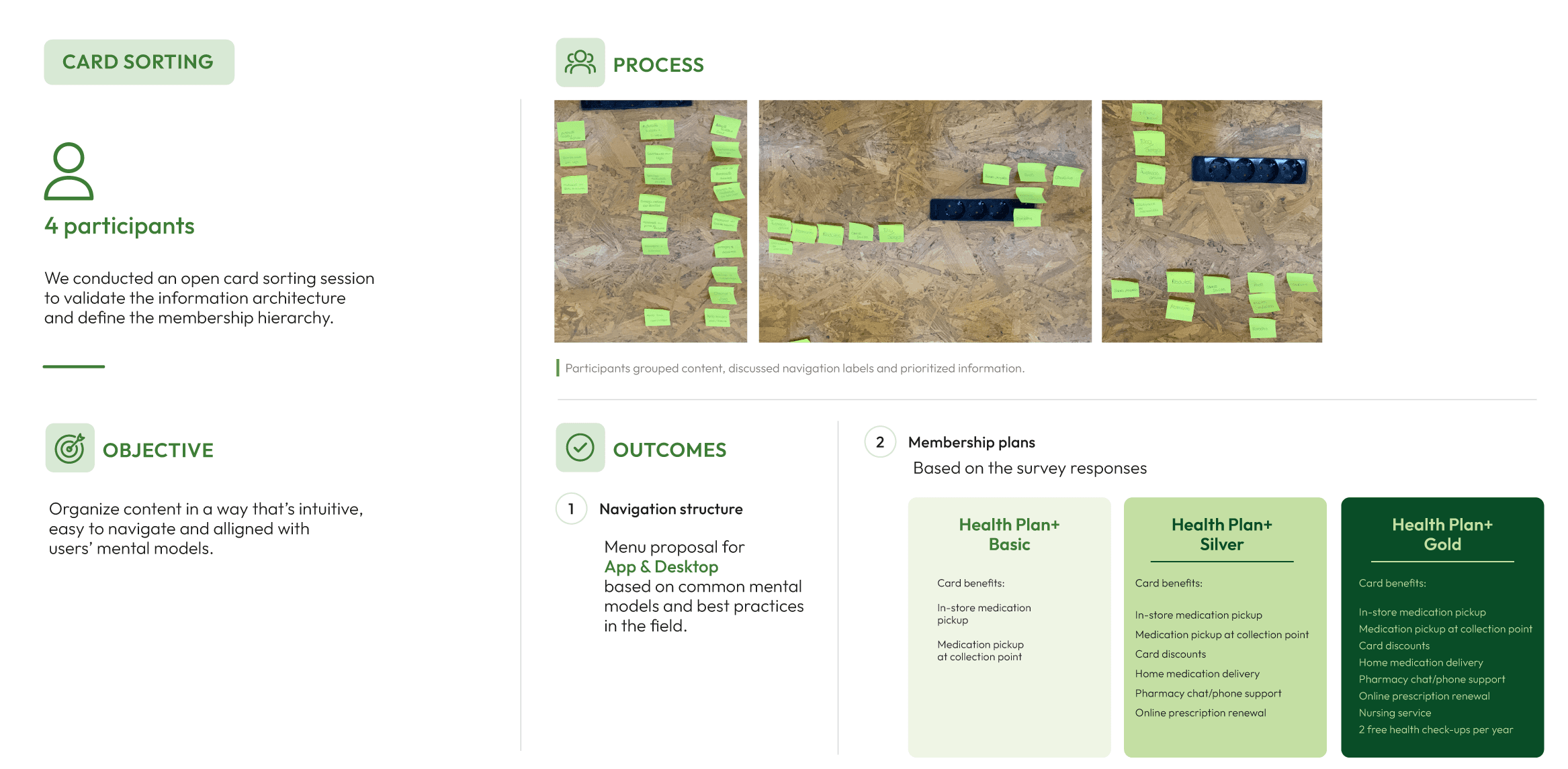
We conducted an open card sorting exercise with four participants to understand how users naturally grouped information and expected it to be organized across the app and desktop experience. The findings helped shape the navigation structure and content hierarchy, while also informing how the Saúde+ membership plans could be structured around different levels of user needs.
Based on these insights and the previous survey findings, we defined three subscription tiers, Basic, Silver and Gold, progressively combining medication pickup, delivery, discounts and healthcare support.

User Journey
The user journey mapped Joana’s experience from recognizing a healthcare need to resolving it through the Saúde+ Plans. It highlighted key pain points around prescription access and pharmacy visits, while identifying opportunities to reduce friction and make recurring medication easier to manage.

Wireframes Low & Mid-Fi
Low-fidelity wireframes allowed us to quickly explore and iterate on the subscription flows, content hierarchy and navigation. These were then developed into mid-fidelity wireframes, refining the structure and interactions before moving into usability testing and visual design.

Usability Tests
We conducted 8 remote usability tests using the mid-fidelity prototype to evaluate the Saúde Card subscription flow. All participants were able to subscribe to the “Plus” plan, confirming that the core subscription journey was clear. However, cancellation proved more challenging: 5/8 participants struggled with the navigation and only 3/8 were able to complete the cancellation successfully.
These findings highlighted a clear usability gap around subscription management, particularly the discoverability and placement of the cancellation option. The results informed the next iteration, with a focus on clearer navigation and a more intuitive cancellation flow.

UI Kit
The UI Kit translated the research and design decisions into a consistent and accessible visual system. It defined typography, colors, reusable components, icons and illustrations, creating a cohesive foundation for the final interface and ensuring consistency across key user interactions.

Responsive Layout
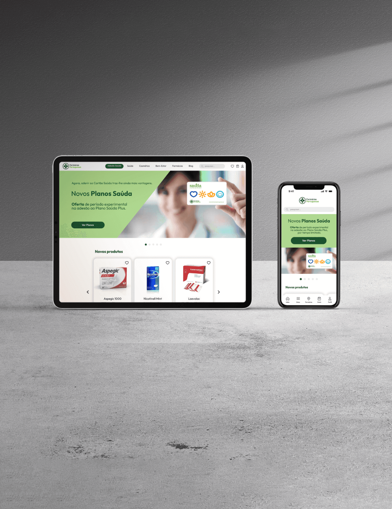
The Saúda Card plans were designed as a responsive experience across mobile, tablet and desktop, adapting the layout and hierarchy to each screen size. Particular attention was given to plan comparison, ensuring that key benefits and pricing remained clear and accessible throughout the subscription journey.
Team
João Almeida Mário Silva Raquel Brotas Sara Pereira
Mentors
Francisco Mouga Hugo Oliveira Vieira Rui Soares
Impact
The project resulted in a digital subscription concept for the Saúda Card, bringing together key user needs identified throughout the research — from easier prescription renewals and medication access to additional healthcare services. By combining qualitative and quantitative research, competitive analysis, card sorting and usability testing, we translated these insights into a more accessible and connected subscription experience.
Beyond the individual features, the project explored how Portuguese Pharmacies could extend their digital services and provide greater convenience for recurring healthcare needs. The final concept demonstrated an opportunity to connect pharmacy services, medication management and healthcare support within a single digital experience.

Portuguese Pharmacies
Portuguese Pharmacies is a nationwide healthcare service offered through the Saúde Card, providing access to pharmacy benefits and proximity services. This project explored how a digital platform and subscription model could simplify access to healthcare services while creating a more convenient and connected experience for users.
Client
EDIT. – Disruptive Digital Education
Segment
Healthcare, Subscription Services
Year
2023
Role
UX/UI Designer
Expertise
Desk Research User Interviews Survey Problem Statement Persona & Empathy Map Benchmarking (Direct & Indirect) User Journey Card Sorting Wireframes Low-Fi & Hi-Fi UI Kit User Testing Prototype
Overview
Portuguese Pharmacies is a nationwide healthcare service offered through the Saúde Card, providing access to pharmacy benefits and proximity services. This project explored how a digital platform and subscription model could simplify access to healthcare services while creating a more convenient and connected experience for users.
Categories
User Experience & User Interface
App
Client
EDIT. – Disruptive Digital Education
Research Methods
Desk Research User Interviews Survey Direct & Indirect Benchmarking Competitor Analysis User Journey Card Sorting User Testing
Softwares & Platforms
Figma & Figjam Adobe Illustrator Adobe Photoshop Similarweb
Project Overview
The project explored how digital services could improve access to community pharmacies and make everyday healthcare tasks more convenient. Research highlighted common frustrations around opening hours, medication availability, queues and prescription management, revealing opportunities for more accessible and connected pharmacy services.
Challenge
The challenge was to design subscription plans that addressed real user needs while balancing convenience, accessibility and trust. The solution needed to simplify key healthcare tasks, from medication pickup to prescription management, while exploring how digital services could extend the role of community pharmacies beyond the physical store.
Starting Process
We began by exploring the role of community pharmacies within Portugal’s healthcare ecosystem, looking at their geographic coverage, accessibility and existing range of services. Desk research and national reports revealed both the strong potential of pharmacies as a point of care and gaps in how some services are currently accessed.
These findings helped us identify opportunities for digital services and subscription models that could extend the role of pharmacies and make everyday healthcare more convenient for users.
Reviews
We analyzed the reviews left by users on Portuguese Pharmacies’ Facebook and Google pages. This allowed us to qualitatively evaluate their main frustrations, recurring complaints, and unmet needs, providing valuable insights to guide the next phases of research and design.
Survey
To validate the patterns identified through our previous research, we conducted a survey with 53 participants to better understand their main frustrations when accessing pharmacy services and which services they would value most in a subscription plan.
The results reinforced the accessibility issues identified earlier. The biggest pain points were finding an open pharmacy nearby (57%), medication availability (55%) and scheduling conflicts (45%), suggesting that the main barriers extend beyond the pharmacy experience itself. Participants were also most interested in services that could reduce these barriers, with prescription renewal (42%) and medication pickup at the pharmacy (36%) ranking highest.
These findings strengthened the opportunity to use digital services to make essential pharmacy tasks more accessible and convenient, with prescription renewal emerging as a particularly relevant feature to explore in the proposed solution.
Heuristic Evaluation
Benchmarking
Interviews & Usability Tests
We conducted 12 semi-structured interviews to understand how patients currently manage recurring healthcare needs and what they expect from pharmacy and Saúde Card services. The interviews revealed a strong need for greater convenience and continuity, particularly around recurring medication, prescription renewals, home delivery and access to personalized support.
We then evaluated the existing Saúde Card subscription experience through usability testing with five participants. Although all participants were able to reach the subscription flow, the experience created significant friction: all five experienced difficulty finding the subscription, two considered giving up, and only one understood the purpose of the banner that led to it.
Together, these findings revealed two complementary challenges: users wanted easier access to recurring healthcare services, but the existing digital experience made those services difficult to discover and understand. This highlighted the need for a more visible, intuitive and accessible subscription journey, directly informing the direction of the proposed solution.
Costumer Journey
Persona & Problem Statement
Based on the insights gathered from interviews, surveys and usability testing, we created Joana Silva as a representation of users who need recurring medication but face difficulties accessing pharmacy services when leaving home is inconvenient. Her goals and pain points reflect recurring needs identified throughout the research.
These findings were translated into a problem statement focused on making recurring medication easier to renew and access remotely. This helped define the direction for a more flexible subscription experience that reduces unnecessary trips to the pharmacy and supports users when they need it most.
Competitive Analysis & Benchmarking
We analyzed national and international pharmacy services, including Boots, PillPack, Méds & Multicare and MyMed24, comparing their features, delivery models and subscription offerings. The analysis revealed a fragmented market, where individual services addressed specific needs but few combined convenience, accessibility and recurring medication support. These gaps helped define opportunities for the proposed Saúde subscription plans.
Benchmarking
Sitemap
Card Sorting
We conducted an open card sorting exercise with four participants to understand how users naturally grouped information and expected it to be organized across the app and desktop experience. The findings helped shape the navigation structure and content hierarchy, while also informing how the Saúde+ membership plans could be structured around different levels of user needs.
Based on these insights and the previous survey findings, we defined three subscription tiers, Basic, Silver and Gold, progressively combining medication pickup, delivery, discounts and healthcare support.
User Journey
The user journey mapped Joana’s experience from recognizing a healthcare need to resolving it through the Saúde+ Plans. It highlighted key pain points around prescription access and pharmacy visits, while identifying opportunities to reduce friction and make recurring medication easier to manage.
Moodboard
Wireframes Low & Mid-Fi
Low-fidelity wireframes allowed us to quickly explore and iterate on the subscription flows, content hierarchy and navigation. These were then developed into mid-fidelity wireframes, refining the structure and interactions before moving into usability testing and visual design.
Usability Tests
We conducted 8 remote usability tests using the mid-fidelity prototype to evaluate the Saúde Card subscription flow. All participants were able to subscribe to the “Plus” plan, confirming that the core subscription journey was clear. However, cancellation proved more challenging: 5/8 participants struggled with the navigation and only 3/8 were able to complete the cancellation successfully.
These findings highlighted a clear usability gap around subscription management, particularly the discoverability and placement of the cancellation option. The results informed the next iteration, with a focus on clearer navigation and a more intuitive cancellation flow.
UI Kit
The UI Kit translated the research and design decisions into a consistent and accessible visual system. It defined typography, colors, reusable components, icons and illustrations, creating a cohesive foundation for the final interface and ensuring consistency across key user interactions.
Responsive Layout
The Saúda Card plans were designed as a responsive experience across mobile, tablet and desktop, adapting the layout and hierarchy to each screen size. Particular attention was given to plan comparison, ensuring that key benefits and pricing remained clear and accessible throughout the subscription journey.
Team
João Almeida Mário Silva Raquel Brotas Sara Pereira
Mentors
Francisco Mouga Hugo Oliveira Vieira Rui Soares
Developers
Impact
The project resulted in a digital subscription concept for the Saúda Card, bringing together key user needs identified throughout the research — from easier prescription renewals and medication access to additional healthcare services. By combining qualitative and quantitative research, competitive analysis, card sorting and usability testing, we translated these insights into a more accessible and connected subscription experience.
Beyond the individual features, the project explored how Portuguese Pharmacies could extend their digital services and provide greater convenience for recurring healthcare needs. The final concept demonstrated an opportunity to connect pharmacy services, medication management and healthcare support within a single digital experience.
Portuguese Pharmacies
Portuguese Pharmacies is a nationwide healthcare service offered through the Saúde Card, providing access to pharmacy benefits and proximity services. This project explored how a digital platform and subscription model could simplify access to healthcare services while creating a more convenient and connected experience for users.
Client
EDIT. – Disruptive Digital Education
Segment
Healthcare, Subscription Services
Year
2023
Role
UX/UI Designer
Expertise
Desk Research User Interviews Survey Problem Statement Persona & Empathy Map Benchmarking (Direct & Indirect) User Journey Card Sorting Wireframes Low-Fi & Hi-Fi UI Kit User Testing Prototype
Project Overview
The project explored how digital services could improve access to community pharmacies and make everyday healthcare tasks more convenient. Research highlighted common frustrations around opening hours, medication availability, queues and prescription management, revealing opportunities for more accessible and connected pharmacy services.
Challenge
The challenge was to design subscription plans that addressed real user needs while balancing convenience, accessibility and trust. The solution needed to simplify key healthcare tasks, from medication pickup to prescription management, while exploring how digital services could extend the role of community pharmacies beyond the physical store.
Research Methods
Desk Research User Interviews Survey Direct & Indirect Benchmarking Competitor Analysis User Journey Card Sorting User Testing
Softwares & Platforms
Figma & Figjam Adobe Illustrator Adobe Photoshop Similarweb
Starting Process
We began by exploring the role of community pharmacies within Portugal’s healthcare ecosystem, looking at their geographic coverage, accessibility and existing range of services. Desk research and national reports revealed both the strong potential of pharmacies as a point of care and gaps in how some services are currently accessed.
These findings helped us identify opportunities for digital services and subscription models that could extend the role of pharmacies and make everyday healthcare more convenient for users.
Reviews
We analyzed the reviews left by users on Portuguese Pharmacies’ Facebook and Google pages. This allowed us to qualitatively evaluate their main frustrations, recurring complaints, and unmet needs, providing valuable insights to guide the next phases of research and design.
Survey
To validate the patterns identified through our previous research, we conducted a survey with 53 participants to better understand their main frustrations when accessing pharmacy services and which services they would value most in a subscription plan.
The results reinforced the accessibility issues identified earlier. The biggest pain points were finding an open pharmacy nearby (57%), medication availability (55%) and scheduling conflicts (45%), suggesting that the main barriers extend beyond the pharmacy experience itself. Participants were also most interested in services that could reduce these barriers, with prescription renewal (42%) and medication pickup at the pharmacy (36%) ranking highest.
These findings strengthened the opportunity to use digital services to make essential pharmacy tasks more accessible and convenient, with prescription renewal emerging as a particularly relevant feature to explore in the proposed solution.
Heuristic Evaluation
Benchmarking
Interviews & Usability Tests
We conducted 12 semi-structured interviews to understand how patients currently manage recurring healthcare needs and what they expect from pharmacy and Saúde Card services. The interviews revealed a strong need for greater convenience and continuity, particularly around recurring medication, prescription renewals, home delivery and access to personalized support.
We then evaluated the existing Saúde Card subscription experience through usability testing with five participants. Although all participants were able to reach the subscription flow, the experience created significant friction: all five experienced difficulty finding the subscription, two considered giving up, and only one understood the purpose of the banner that led to it.
Together, these findings revealed two complementary challenges: users wanted easier access to recurring healthcare services, but the existing digital experience made those services difficult to discover and understand. This highlighted the need for a more visible, intuitive and accessible subscription journey, directly informing the direction of the proposed solution.
Costumer Journey
Persona & Problem Statement
Based on the insights gathered from interviews, surveys and usability testing, we created Joana Silva as a representation of users who need recurring medication but face difficulties accessing pharmacy services when leaving home is inconvenient. Her goals and pain points reflect recurring needs identified throughout the research.
These findings were translated into a problem statement focused on making recurring medication easier to renew and access remotely. This helped define the direction for a more flexible subscription experience that reduces unnecessary trips to the pharmacy and supports users when they need it most.
Persona & Problem Statement
Sitemap
Competitive Analysis & Benchmarking
We analyzed national and international pharmacy services, including Boots, PillPack, Méds & Multicare and MyMed24, comparing their features, delivery models and subscription offerings. The analysis revealed a fragmented market, where individual services addressed specific needs but few combined convenience, accessibility and recurring medication support. These gaps helped define opportunities for the proposed Saúde subscription plans.
Moodboard
Card Sorting
We conducted an open card sorting exercise with four participants to understand how users naturally grouped information and expected it to be organized across the app and desktop experience. The findings helped shape the navigation structure and content hierarchy, while also informing how the Saúde+ membership plans could be structured around different levels of user needs.
Based on these insights and the previous survey findings, we defined three subscription tiers, Basic, Silver and Gold, progressively combining medication pickup, delivery, discounts and healthcare support.
User Journey
The user journey mapped Joana’s experience from recognizing a healthcare need to resolving it through the Saúde+ Plans. It highlighted key pain points around prescription access and pharmacy visits, while identifying opportunities to reduce friction and make recurring medication easier to manage.
Wireframes Low & Mid-Fi
Low-fidelity wireframes allowed us to quickly explore and iterate on the subscription flows, content hierarchy and navigation. These were then developed into mid-fidelity wireframes, refining the structure and interactions before moving into usability testing and visual design.
Usability Tests
We conducted 8 remote usability tests using the mid-fidelity prototype to evaluate the Saúde Card subscription flow. All participants were able to subscribe to the “Plus” plan, confirming that the core subscription journey was clear. However, cancellation proved more challenging: 5/8 participants struggled with the navigation and only 3/8 were able to complete the cancellation successfully.
These findings highlighted a clear usability gap around subscription management, particularly the discoverability and placement of the cancellation option. The results informed the next iteration, with a focus on clearer navigation and a more intuitive cancellation flow.
UI Kit
The UI Kit translated the research and design decisions into a consistent and accessible visual system. It defined typography, colors, reusable components, icons and illustrations, creating a cohesive foundation for the final interface and ensuring consistency across key user interactions.
Responsive Layout
The Saúda Card plans were designed as a responsive experience across mobile, tablet and desktop, adapting the layout and hierarchy to each screen size. Particular attention was given to plan comparison, ensuring that key benefits and pricing remained clear and accessible throughout the subscription journey.
Team
João Almeida Mário Silva Raquel Brotas Sara Pereira
Mentors
Francisco Mouga Hugo Oliveira Vieira Rui Soares
Developers
Francisco Mouga Hugo Oliveira Vieira Rui Soares
Impact
The project resulted in a digital subscription concept for the Saúda Card, bringing together key user needs identified throughout the research — from easier prescription renewals and medication access to additional healthcare services. By combining qualitative and quantitative research, competitive analysis, card sorting and usability testing, we translated these insights into a more accessible and connected subscription experience.
Beyond the individual features, the project explored how Portuguese Pharmacies could extend their digital services and provide greater convenience for recurring healthcare needs. The final concept demonstrated an opportunity to connect pharmacy services, medication management and healthcare support within a single digital experience.
